“Surfing And Coffee” …………At Tamalpais Junction, Caliifornia
THE STORY
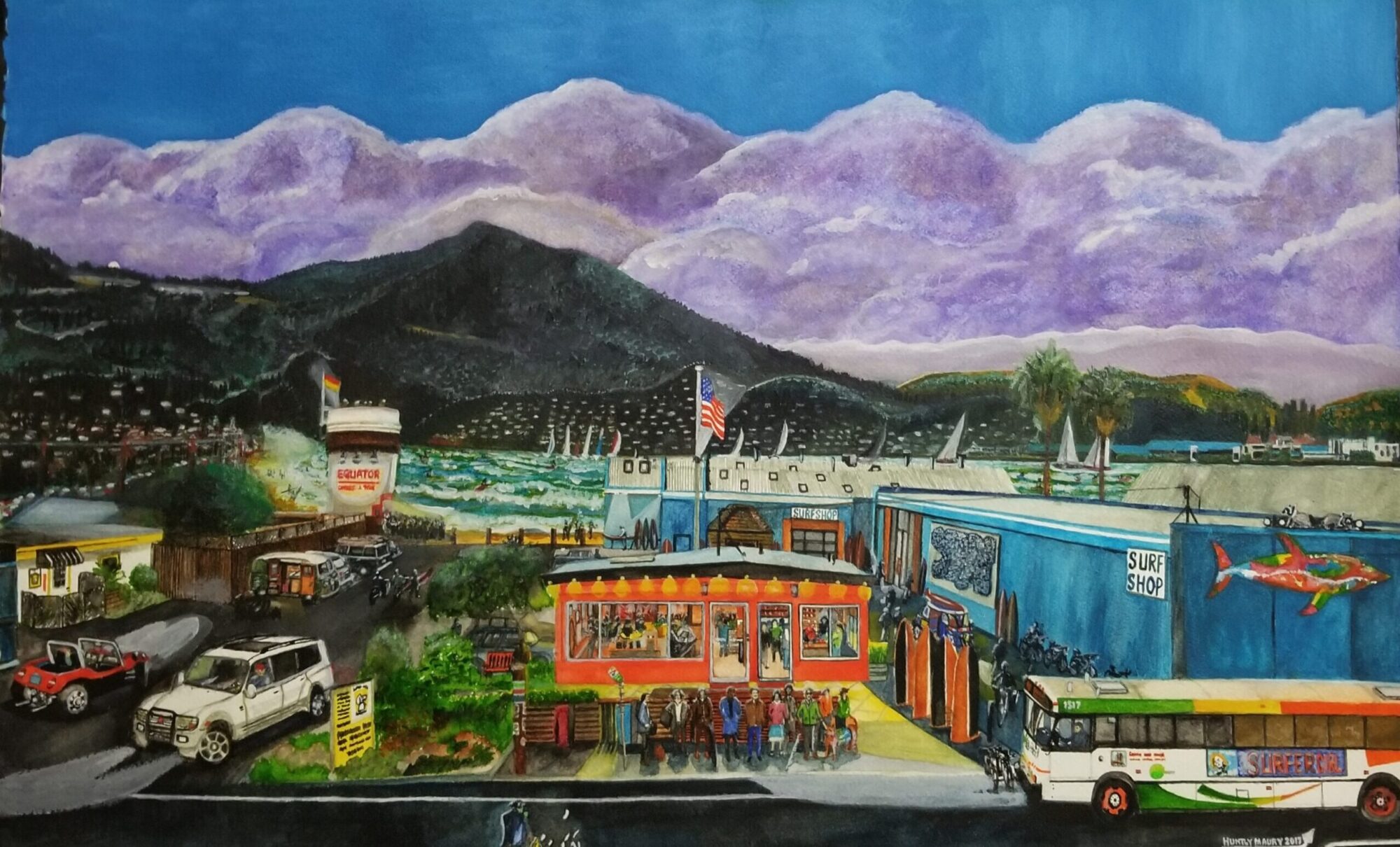
Of all the watercolour paintings I have created over the years, “Surfing And Coffee” ……Tamalpais Junction, CA is undoubtedly one of my most personal ones completed for reasons of which you are about to learn about. It is the first painting to be started since my right hand became fractured in California during the month of May 2017, the first watercolour painting in a series to be completed in London and the first for the finest of any Coffee establishment that I would wish to visit on a regular basis. It is a story of a journey that started and lasted for almost three years and now with its true completion placed indelibly on art paper, it now ends a remarkable story. The most remarkable thing is that it could easily have never happened….
I had never heard of Equator Coffee Company in the months beginning around 2014. If I wasn’t assigned to driving a Golden Gate Bus that one afternoon from the Financial District of San Francisco northbound to downtown Mill Valley and had I not had a friendly passenger sitting in the front seat, I would be none the wiser of its existence today. In fact, when he alighted from the bus right outside the red prefab building he uttered the words ‘ Driver, if you ever want to taste the best coffee in the area, you have to give this place a try – go on your day off, you won’t be disappointed’ Being a professional bus driver I remember that I had heard similar words of advice from others which came to nothing however I have always been willing to try a new place out.
I finally found myself at this location early one Saturday morning just as they were opening. When I received my first fresh cup of coffee and sampled it…the initial sip lit my face up with a huge smile…that passenger was absolutely right…it was the best tasting coffee I have ever sampled and I was instantly hooked. I became in the months and indeed years ahead a very regular customer to this location. I became spoilt with its coffee and wanted no other to try. I continued to visit this location on weekends only as my work schedule couldn’t find me close to the area.
Stage One
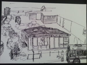
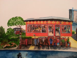
When confronted with a large blank piece of whole sheet (30 x 22 inches) watercolour paper, you can very easily be overwhelmed by the sheer size of your project ahead of you. You have to spend some time in planning the painting in several stages. You have to consider all the angles, perspective and dimensions of the foreground areas, for without these requirements being correct, you are prone to continue the inaccuracies through to the background and completion of the painting. Preparation is so very important to any artist undertaking this kind of a painting. As you can see from the original Ideas and Notes sheet (above) that I completed during a morning cup of coffee. The whole paper is divided into a mental image of compartments throughout the whole process. Obviously, the foreground is going to be the most critical area to work on as it will be the closest to the eye when it is completed. With this painting I started with my usual faint wash of Davy’s Gray paint (I never use any pencil or pen marks on any of my paintings) to get the approximate position of the main areas to be completed at a later stage. The passengers at the bus stop were the first subjects to be brushed faintly into position. The main large object I had to get just right was the Golden Gate Transit bus on the right hand side of the paper
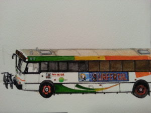
as divided into a mental image of compartments throughout the whole process. Obviously, the foreground is going to be the most critical area to work on as it will be the closest to the eye when it is completed. With this painting I started with my usual faint wash of Davy’s Gray paint (I never use any pencil or pen marks on any of my paintings) to get the approximate position of the main areas to be completed at a later stage. The passengers at the bus stop were the first subjects to be brushed faintly into position. The main large object I had to get just right was the Golden Gate Transit bus on the right hand side of the paper as it was heading towards the bus stop. This is a bus that I am all too familiar with in its detail and appearance as I drove them for fifteen years with this very company. Originally, I was debating whether to use an Equator Coffee looking advertisement on the side of the vehicle or a Surfing style billboard poster – the latter being chosen in honour of Alisa, the person who originally inspired me to complete this artwork. The bus itself carries the earlier, more colourful paint scheme when these buses first were in operation. It is far more cheery and warm in looks than the present day buses display as their scheme. It has a fun look to it all especially when the surfing environment is introduced and the parody of the fictitious ocean that is placed in the background.
Sketch of painting
As you can see from the original Ideas and Notes sheet (above) that I completed during a morning cup of coffee. The whole paper is divided into a mental image of compartments throughout the whole process. Obviously, the foreground is going to be the most critical area to work on as it will be the closest to the eye when it is completed. With this painting I started with my usual faint wash of Davy’s Gray paint (I never use any pencil or pen marks on any of my paintings) to get the approximate position of the main areas to be completed at a later stage. The passengers at the bus stop were the first subjects to be brushed faintly into position. The main large object I had to get just right was the Golden Gate Transit bus on the right hand side of the paper as it was heading towards the bus stop. This is a bus that I am all too familiar with in its detail and appearance as I drove them for fifteen years with this very company. Originally, I was debating whether to use an Equator Coffee looking advertisement on the side of the vehicle or a Surfing style billboard poster – the latter being chosen in honour of Alisa, the person who originally inspired me to complete this artwork. The bus itself carries the earlier, more colourful paint scheme when these buses first were in operation. It is far more cheery and warm in looks than the present day buses display as their scheme. It has a fun look to it all especially when the surfing environment is introduced and the parody of the fictitious ocean that is placed in the background.
Picture of Bus
When the bus was almost complete except for small finishing details, my attention turned to the actual structure of the Equator Coffee Company’s red prefab modular building which closely sits in the centre of the painting, slightly away and behind the bus stop area. I wanted to include some interior detail within this building but it was somewhat limited to available space. In regards to its exterior, I planned to include the outside lighting as if it was very early morning just to give a little more atmosphere and spirit to the painting. The actual location has propped up surfboards facing towards the roadway for decoration and I painted them with contrasting colours to give them a little more depth to the picture.
Sketch of building
Stage Two
With the first stage almost over with just a few areas to fill out, I came to the next stage of the painting which was the main structure of the Proof Lab Surf Shop. This surrounds the right side of the Equator building structure all the way to the very back of the parking lot. The profile was a relatively straight forward building structure, complete with corrugated roofs and fittings. I made the structure a little more formidable in height and size than the real building to give it a more encapsulated feel to the picture. There was a large Island Mural attached to the side of the building to add which I lightened up to blend into the scenery and two signs displaying Surf Shop. At the front of this shop facing the roadway there was a large decorated mural of a fish to add. Above the fish and floodlights a few Raccoons are looking around for food. Behind the Equator building, there was a light pole over the parking lot upon which I decided to place an American Flag.
The only other area within this stage of the painting to complete was the area to the left and behind the Mitsubishi. There was a dog kennel business located there which, again, extends to the rear of the property. There was a fence structure to include that follows the lot down towards the area of “the beach”. To add some interest and to keep the eye moving, I painted an old Camper Van with opened doors and a table with seat beside the vehicle.
The Completion
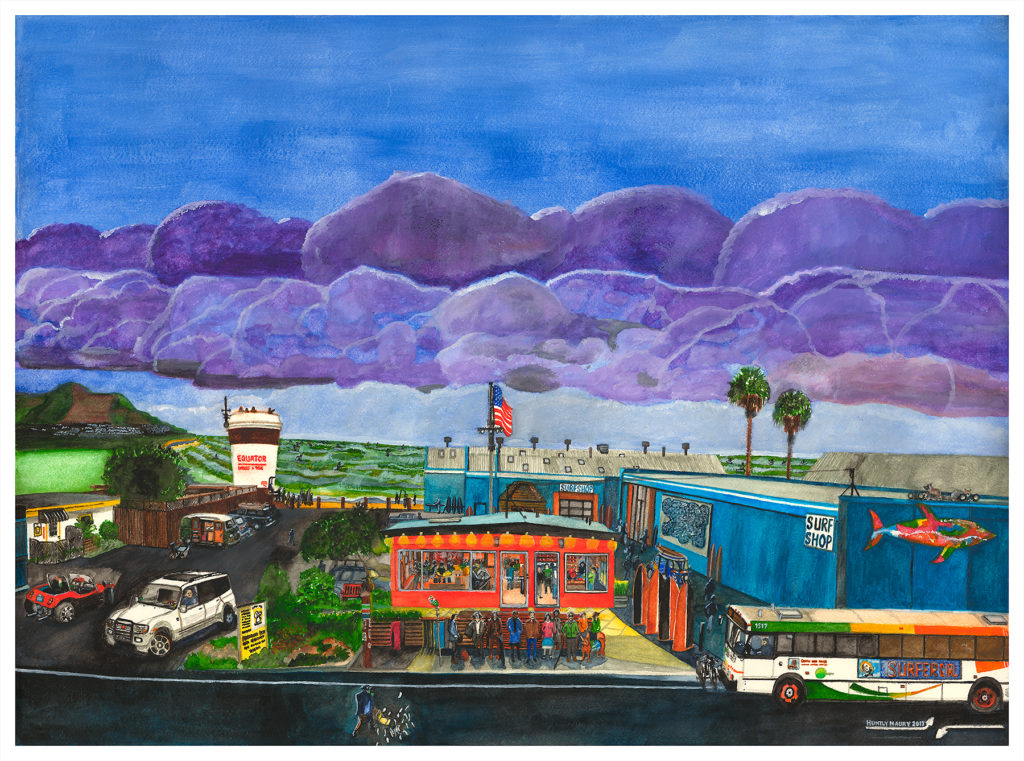
This was start of where the real parody of this painting began….Basically with all the structures completed my attention was now towards the background and the sky. The two were challenging and not without revisions! When I first took into account that the subject of the painting was solely to do with coffee, I had already thought of including an enormous Equator Coffee Cup sitting on the “improvised beach ” close to the parking lot many months earlier. It was to be no ordinary coffee cup either as it was not only another source for coffee fed surfers and beachcombers to enjoy but even more effectively, an observation base for overhead lifeguards to observe the imaginary surf conditions of the Richardson Bay! The only difficult decision before painting it was the actual size of the cup – too small would surely be insignificant, too large would be overwhelming and unattractive. I believe I actually got the size of that cup just right for this scene.
When I first conceived the idea I wanted to paint the water in imaginary brownish coffee colours with the traditional decorated froth you find on top of your Latte as surf! It would be unique I said to myself but when I did my initial faint wash onto the painting and stood back to see the results, I realized that this was a terrible mistake and I would be a recipient of the most unfavourable comments thereafter. I redid the ocean and surf into pretty challenging conditions for the local surfers, quite opposite to the reality of the wetlands that occupy the area daily but, at least, the water became an acceptable green! I also added a distant looking Mount Tamalpais with a fog bank approaching its way to hide the remainder of the Mill Valley area. I finished the image with a pair of palm trees to break up the scene and to give it a more Californian feel to it.
The sky was to be the final challenge for me and at this stage, I was truly running out of time to complete the project. I first envisioned an early morning sunrise but as I started to paint the all too many small clouds that I would need to complete the majority of blue filled paper, I realized that it would out challenge me more! The majority of my essential time was being spent elsewhere. I started to do a bank of formidable looking clouds which corresponded to the conditions of the surf below. I chose a purple concentrated coloured cloud formation, as overall this painting is very much supposed to be a “fun” painting rather than a serious one! I hope you agree with its results.
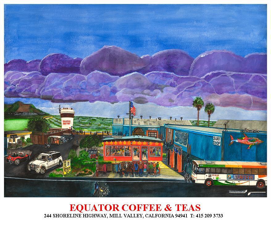
When I returned to California I provided the printers with the uncompressed scanned image from London. I thought that they would be able to simply use it without any amendments. Different scanning machines from London can correspond to different finishes in use with the Californian printer’s machines. From the original completed painting as shown earlier and the more colour saturated, final version from the printers at the top of this article I had to spend hours mulling over the differences from London to San Rafael and what was achieved. In the end, rightly or wrongly, I decided to retain the printer’s final proof.
Huntly Maury
September 2017
Original Watercolour Painting completed in London 2017
Dimensions: 30″ x 22″ inches